Improving students' trust and transparency in apartment hunting

Role
Product Designer
Timeline
5 weeks
Tools
Figma
Team
2 Product Designers
1 Developer
1 UX Researcher
OVERVIEW
Bruinshack helps UCLA students navigate housing.
Searching for housing at UCLA is a tedious and complicated process. There’s a plethora of information to sort through on student social media groups and from peers, and it’s difficult to tell what listings are legitimate or not. Bruinshack aims to be the go-to platform to help students through this process.
Problem
Students aren’t able to find adequate information to make informed decisions when looking for apartments, leading to high drop-off rates.
Solution
An apartment display page with clearer content and transparency, improving user trust and reassurance in the housing search process.
BACKGROUND
Engagement on the ShackPanel, an apartment profile page, has been on the decline. Why?
According to our analytics team, our users haven’t really been engaging with the apartment pages in particular. Students aren’t following through with potential listings and reaching out with landlords/property owners.
RESEARCH
First, we conducted 10 interviews with students to look at how they’re navigating this page.
In our interviews with UCLA students of varying years and living situations, we asked about their current apartment-hunting experiences and in navigating Bruinshack, and then focused more on the ShackPanel page itself.
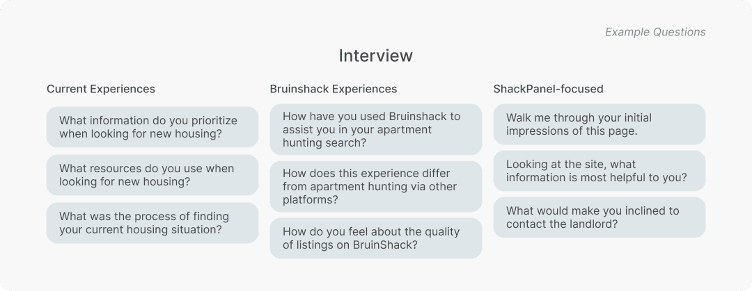
Key Takeaways
Navigation Difficulties
Users struggled to find relevant information easily in the unit description. This poses a barrier in being able to decide whether a specific listing fits their needs or not.
Transparency Gap
The apartment listings don’t include enough pictures or important details that students typically need to help fully determine if the apartment meets their needs. This availability of information impacts how much users view the legitimacy of the apartment.
Better Alternatives
80% of users resorted to other methods such as word of mouth, Reddit, and Facebook to search for student apartments, with Bruinshack being an alternative choice.
How might we improve the way students are gathering information about an apartment in order to better establish trust and transparency?
EVALUATING CURRENT DESIGNS
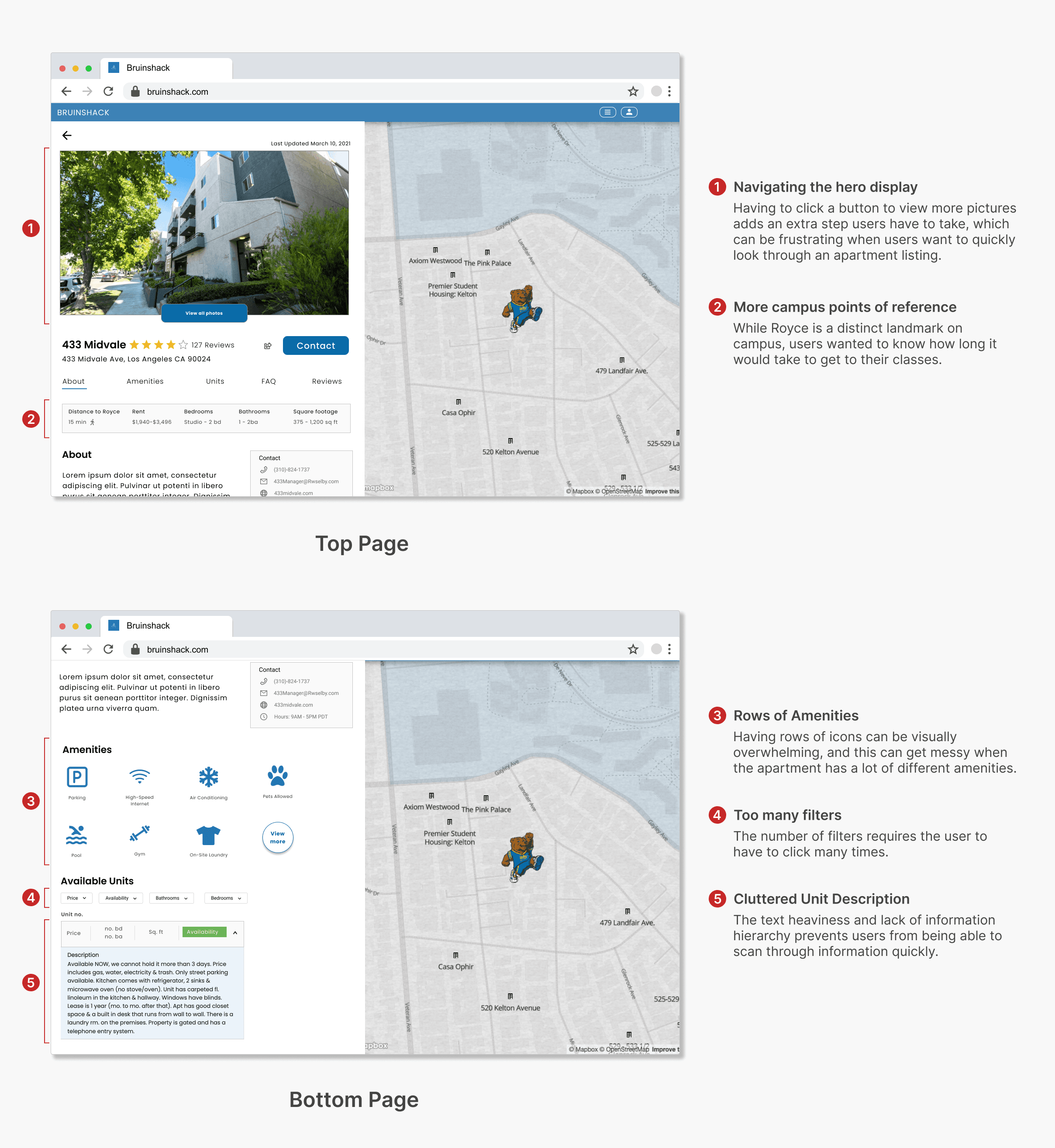
I then audited the current page with key user and research takeaways in mind.
Using the research question as my north star, I then proceeded to evaluate different features on the page and what changes could be made to address the mentioned navigation and transparency issues.
COMPETITIVE ANALYSIS
Exploring the credibility factor of r/ucla
In addition to evaluating the ShackPanel page, I wanted to explore opportunities for Bruinshack to align closer with its value proposition of being a trusted resource for students.
During user interviews, r/ucla emerged as a primary resource in the apartment search. Even though the platform isn’t a direct competitor, it was worth looking into what made it a reliable source for students.
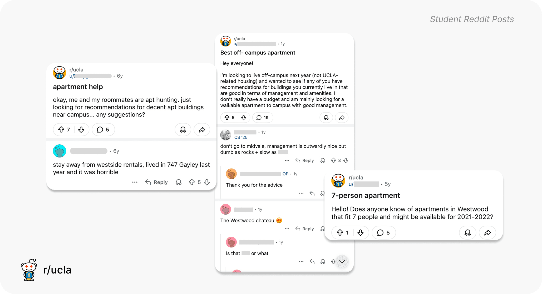
The subreddit isn’t a dedicated housing platform, but it’s been a longstanding community forum for students to ask questions and help each other out, making it naturally a convenient space to inquire about housing.
Seeing this preference, I identified 2 themes that contributed to student reliability:
Community Verification
The public nature of the subreddit allows information to be self-regulated within the community. Through downvotes and comments, users can confirm or dispute posts reviewing apartments, giving it more or less credibility.
Anonymity
Anonymity lowers the barrier for honest feedback, allowing students to post unfiltered reviews without the fear of their landlords finding out.
Ideation
Translating Insights: Ideating Trust Signals in Reviews
I analyzed Yelp and Amazon, community-based apps that utilize reviews, to inform my approach. Something that stood out to me about Yelp was how it explicitly signaled to users that businesses can't tamper with their reviews, giving reassurance that what users were seeing were genuine reviews. Meanwhile, Amazon confirmed the credibility of the user with a "Verified Purchase" badge.
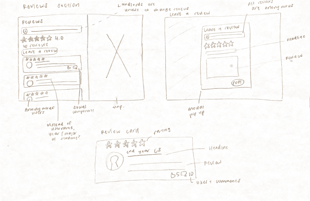
In these quick sketches, I made sure to incorporate the themes of community verification and anonymity through the student year identifier and info block assuring users that landlords are unable to alter reviews.
DESIGN PROCESS
I explored design changes through low-fidelity designs.
After auditing, I then pivoted to looking at different features on the page and what changes could be made to address the mentioned pain points.
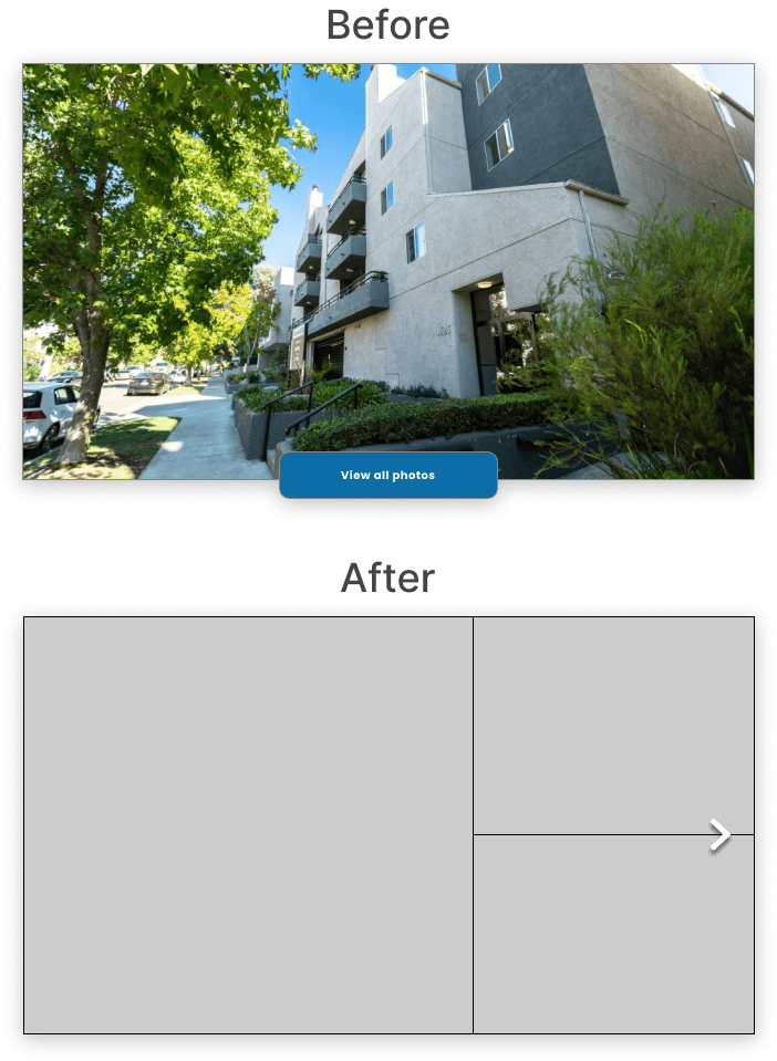
Feature 1: Apartment Hero Display
Replacing the “View all photos” button, I decided that it would be much easier for users to be able to view the images within the page.
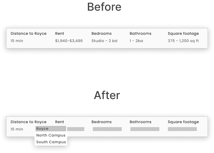
Feature 2: Clearer Distance Dropdown
Since users collectively agree that commuting time to classes is an important factor, I decided to include 2 additional landmarks on North and South Campus.
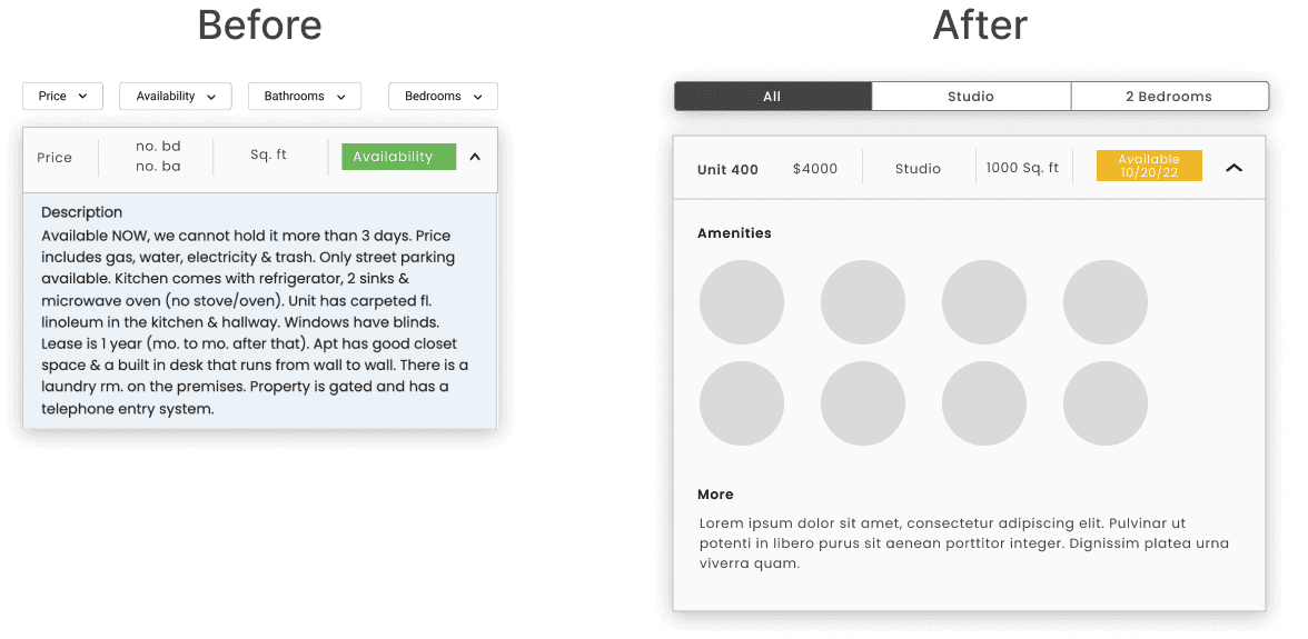
Feature 3: Unit Description
The amount of different filters required a lot of clicks, so I decided to simplify it to a filter based off of rooms. To combat the text-heaviness, I added icons and smaller sections to establish hierarchy.
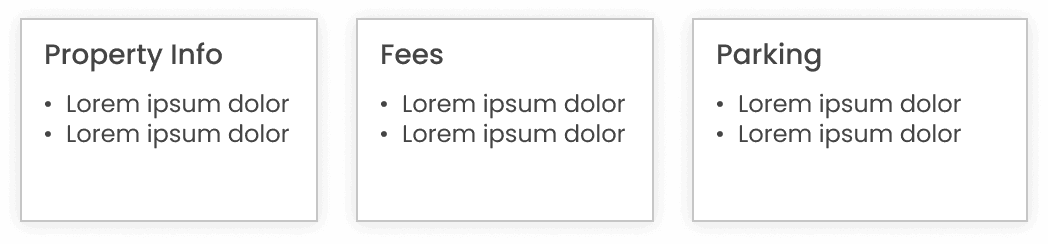
Feature 4: Lease Information
Lease information is pertinent information since students may have dealbreakers, promoting transparency between apartment managers and students.
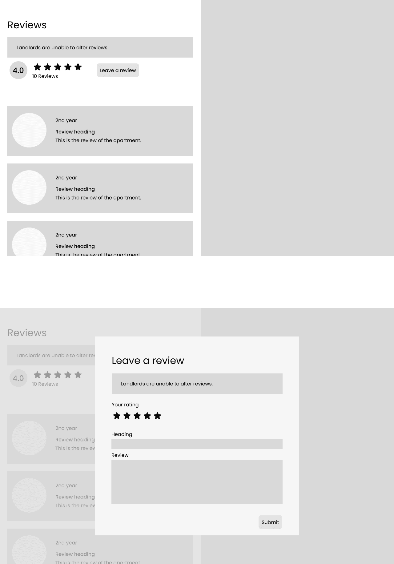
Feature 5: Review Section
I added trust signals by communicating to apartment searchers that landlords couldn't alter reviews, and verified the credibility of reviewers by only indicating their school year, maintaining anonymity.
User testing
Validating the experience through usability testing
To validate the design and uncover potential friction points, I conducted usability testing with 10 participants. I utilized a hybrid mix of mid and high fidelity design to ensure that users could still get any idea of the user experience without being distracted by the details and aesthetics.
We asked users to conduct tasks to observe usability, and also asked for their thoughts on parts of the design. Their feedback helped inform changes we would make in the following iteration.
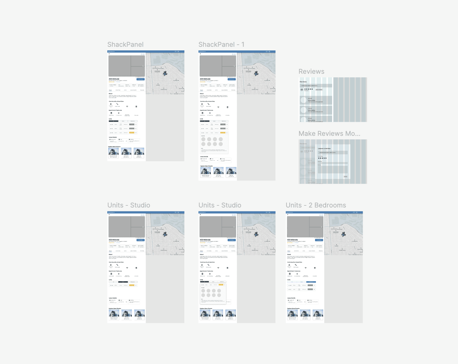
FINAL DESIGNS
Presenting the final designs
After rounds of iteration and feedback sessions, I converted the low fidelity designs to high fidelity mockups.
Apartment carousel
Quickly scan different images without having to leave the page.
Added campus markers
Check how long the commute is to your classes, whether it be in North or South Campus.
Cleaner Unit description
Parse through the details of a unit you’re interested in with ease.
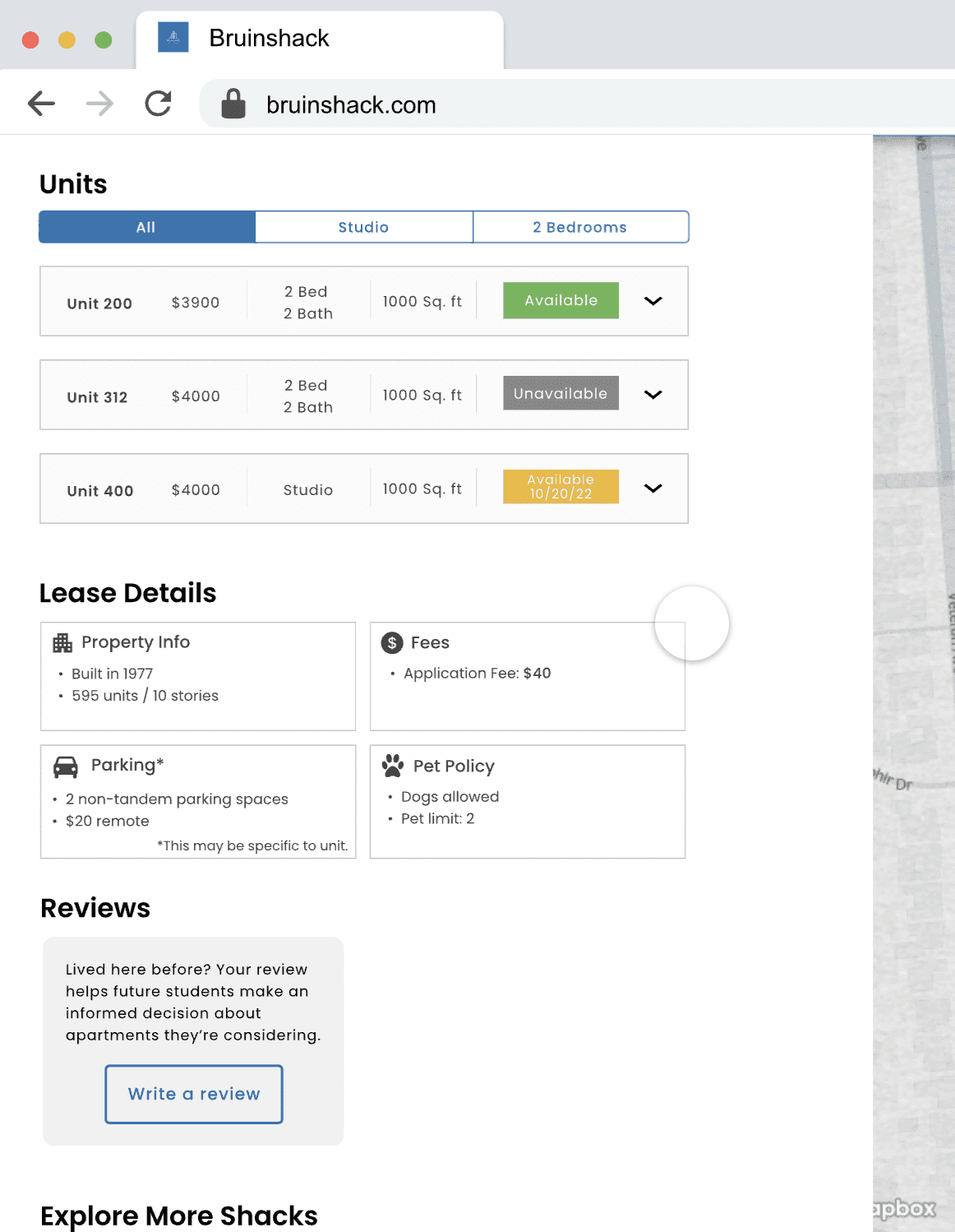
New lease details
Find out more about the property and the lease.
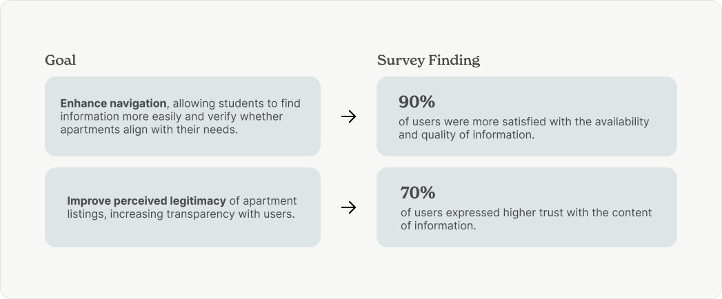
RESULTS
Follow-up User Surveys
After the high-fidelity designs, we then sent out follow-up user surveys to see whether we were able to successfully address the issues we identified from our user research.
Next Steps
Due to the constraints and limitations from the project timeline, we weren’t able to flesh out certain aspects of the design and experience. Thus, for our next steps, we intend to tackle these goals in the next iteration.
Making the UX seamless on the landlord side.
At the end of the day, landlords themselves are entering in the information, so we need to ensure that the user experience for them to do so is seamless on this side as well.
Explore social components.
Unlike Bruinshack, Facebook has a social aspect where users can interact and see interactions such as likes and comments. Adding a similar social component could be worth exploring in fostering user trust.
REFLECTION
What I Learned
Building user trust.
There's no specific formula for establishing trust with users, but design can be the bridge to this. Building this relationship with users is key in user retention.
Understanding project limitations.
Given the limited resources of a student organization, it seems highly unrealistic to actually be able to fully replace Facebook as the go-to housing search platform, but what we can focus on is addressing problems within our reach.